
2024
Fidelity Life B2B Platform
Project Lead | 18 Months | Lean UX
End-to-end
Case Study
Overview
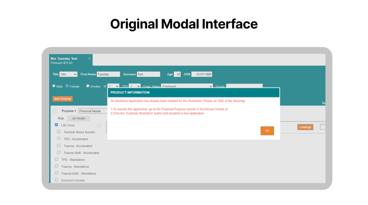
Without change, Fidelity risked losing both advisers and customers to competitors offering faster, easier digital solutions.
A lengthy and manual onboarding experience with outdated UI components kept them lagging behind competitors who were already offering a modern digital experience. Advisor’s faced uncertainty in their application process, leading to negative business impact.
As Senior UX/UI designer in an Agile Squad my responsibilities included:
Discovery: Adviser interviews, customer journey mapping, conditional logic flowcharts, stakeholder feedback.
Rapid prototyping: Key page flows, microinteractions, and underwriting transparency.
User testing and synthesis with a UX Researcher: 10 advisers over 2 weeks.
Handover QA: Design system governance across 3 brands using tokens.
Communication and reporting: Shared regular updates and results with the wider the CX Tribe and my Design Chapter.

Lean UX
I approached the project with a Lean UX mindset.
I validated my hypothesis by using various UX methods as needed.
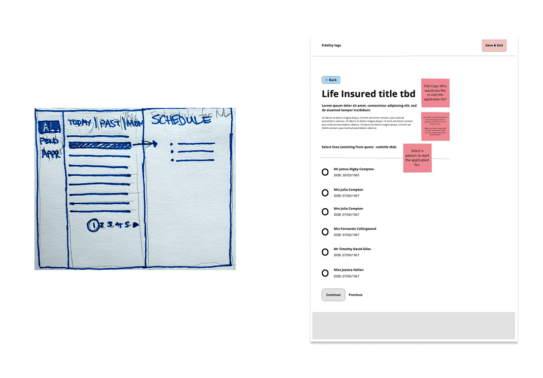
I sketched out early concepts with pen and paper and then facilitated co-design workshops with POs and BAs to develop the best ones.
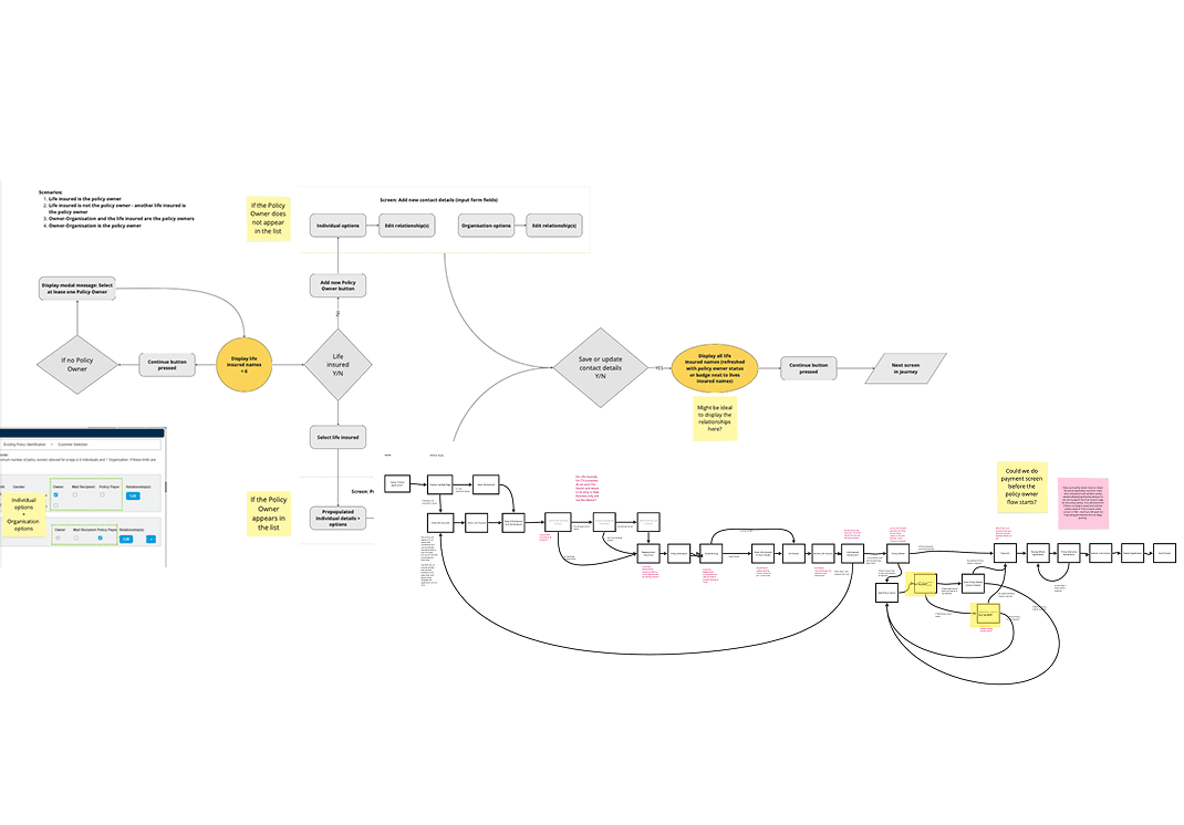
I documented user stories, use case scenarios and flow charts for complex logic for key stakeholders via Miro, Confluence and DevOps.
I created internal polls for stakeholders from different tribes to seek feedback regarding the various button interactions and states for key components.
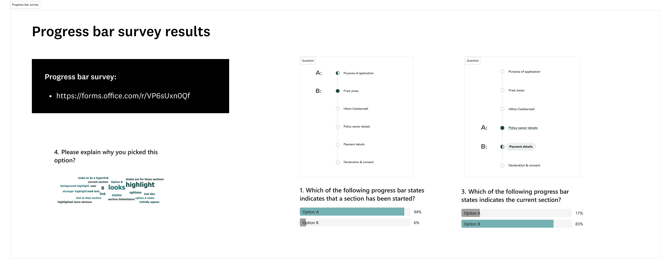
I worked closely with a UX Researcher to align on moderated testing scripts and took turns observing users and recording feedback. We synthesised insights by grouping information into themes.

Design System Governance
I created a scalable Design System that supported multiple brands and future enhancements.
My work was successfully launched across Fidelity Life’s network and was white labelled for NZHL Life. It was tokenised to integrate with Westpac's Digital Advice Tool using JSON.
Marketing collaboration: Components from my design system were applied across the entire ecosystem (website, emails and digital products)
Storybook component integration: Brands include Fidelity Life, NZHL and Westpac.
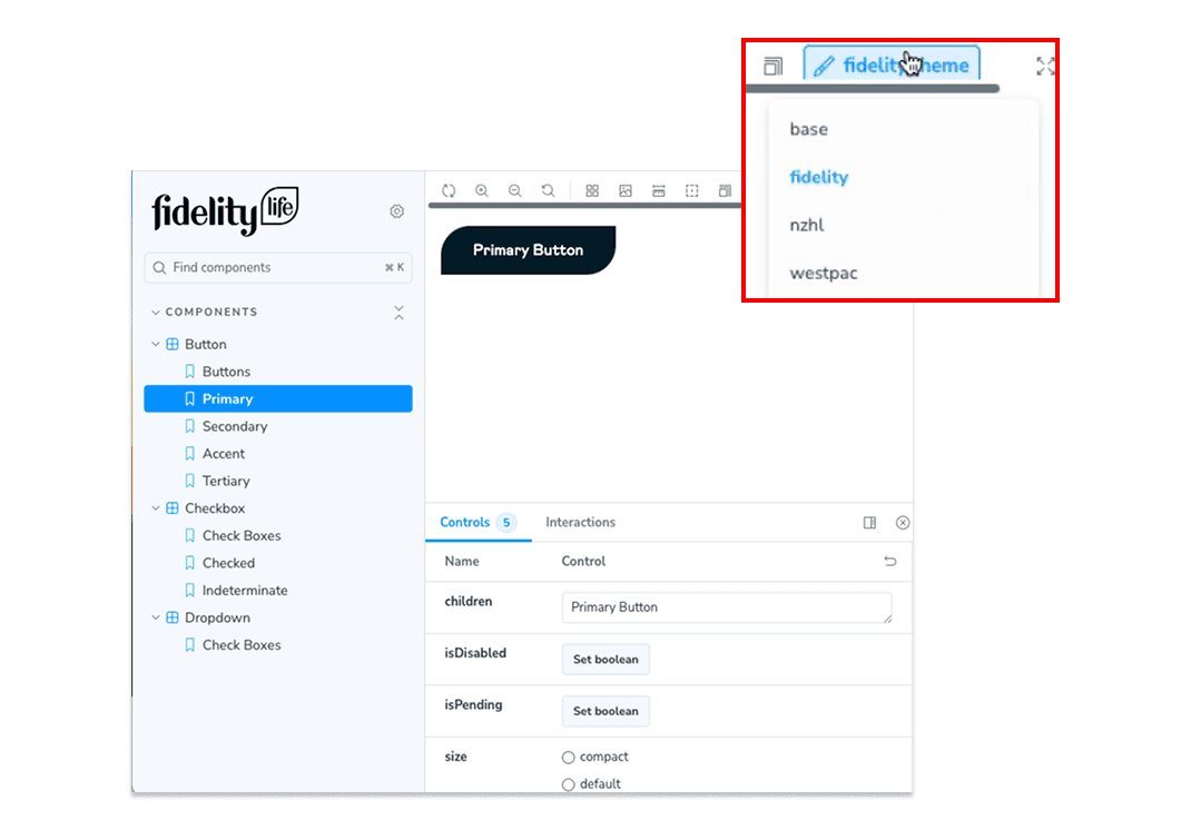
To avoid drift and misalignment, I introduced a structured governance model, versioning discipline, and tight collaboration with designers and engineers — improving design-to-code accuracy and system reliability.
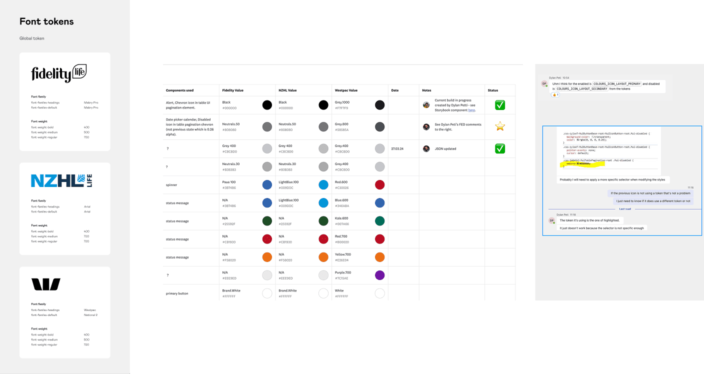
To improve design-to-dev handoff, I ensured components are built for Reusability, Performance, and Accessibility.
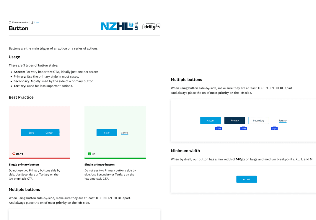
Detailed component diagrams, helped mitigate wasted dev efforts.

The Results
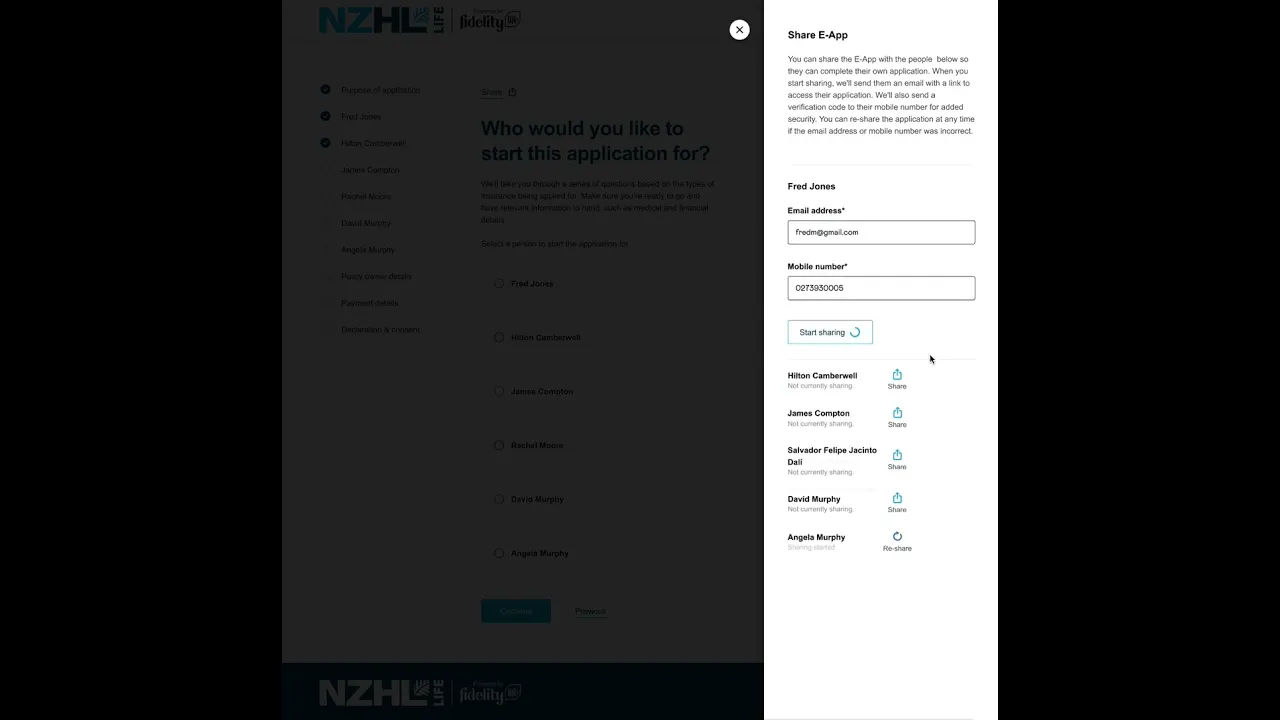
Instant temporary cover and share feature streamlined journeys and improved completion rates.
Reduced Operational Costs: Fewer support calls and automated underwriting saved $1335 per application.
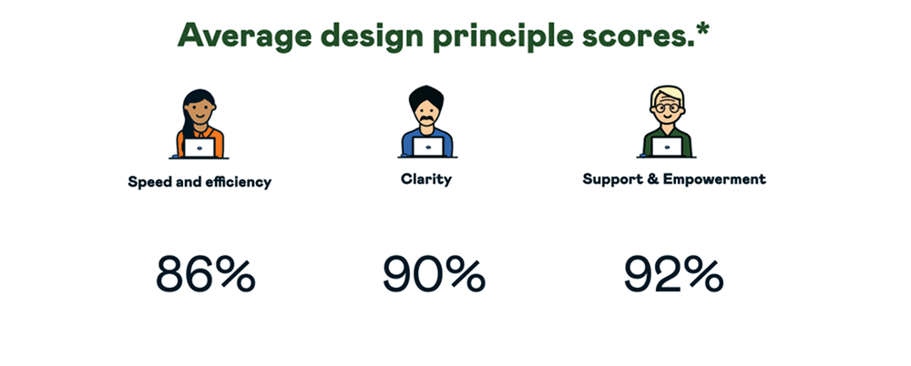
Boosted NPS & Adviser Satisfaction: Positive feedback and measurable score increases. Advisers reported higher clarity and trust in automation.
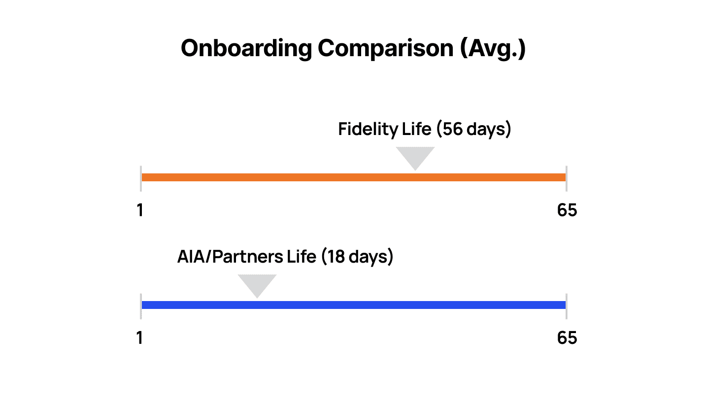
Faster Onboarding: Streamlined journeys improved completion rates.
Higher completion rates: Launched successfully as a scalable, future-ready platform with clearer insurance recommendations.
New Share Feature:
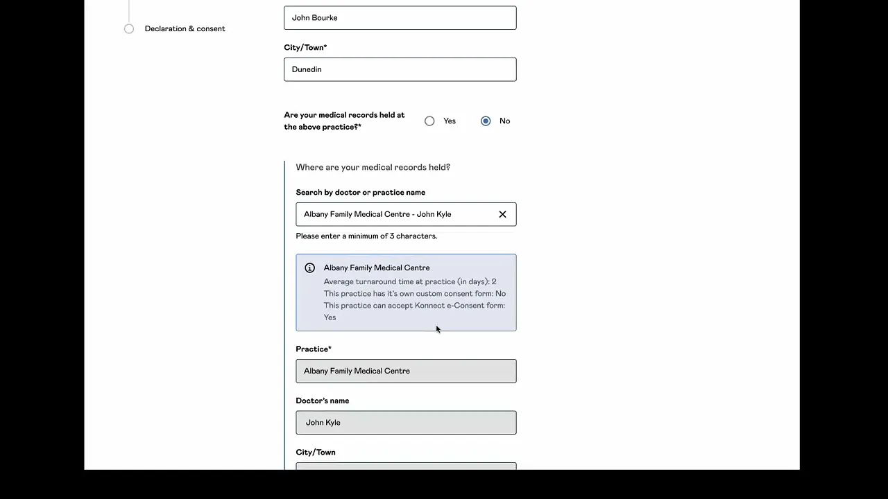
Medical Records Interaction Design:

More Works
(SG — 02)
©2026


2024
Fidelity Life B2B Platform
Project Lead | 18 Months | Lean UX
End-to-end
Case Study
Overview
Without change, Fidelity risked losing both advisers and customers to competitors offering faster, easier digital solutions.
A lengthy and manual onboarding experience with outdated UI components kept them lagging behind competitors who were already offering a modern digital experience. Advisor’s faced uncertainty in their application process, leading to negative business impact.
As Senior UX/UI designer in an Agile Squad my responsibilities included:
Discovery: Adviser interviews, customer journey mapping, conditional logic flowcharts, stakeholder feedback.
Rapid prototyping: Key page flows, microinteractions, and underwriting transparency.
User testing and synthesis with a UX Researcher: 10 advisers over 2 weeks.
Handover QA: Design system governance across 3 brands using tokens.
Communication and reporting: Shared regular updates and results with the wider the CX Tribe and my Design Chapter.
Lean UX
I approached the project with a Lean UX mindset.
I validated my hypothesis by using various UX methods as needed.
I sketched out early concepts with pen and paper and then facilitated co-design workshops with POs and BAs to develop the best ones.
I documented user stories, use case scenarios and flow charts for complex logic for key stakeholders via Miro, Confluence and DevOps.
I created internal polls for stakeholders from different tribes to seek feedback regarding the various button interactions and states for key components.
I worked closely with a UX Researcher to align on moderated testing scripts and took turns observing users and recording feedback. We synthesised insights by grouping information into themes.
Design System Governance
I created a scalable Design System that supported multiple brands and future enhancements.
My work was successfully launched across Fidelity Life’s network and was white labelled for NZHL Life. It was tokenised to integrate with Westpac's Digital Advice Tool using JSON.
Marketing collaboration: Components from my design system were applied across the entire ecosystem (website, emails and digital products)
Storybook component integration: Brands include Fidelity Life, NZHL and Westpac.
To avoid drift and misalignment, I introduced a structured governance model, versioning discipline, and tight collaboration with designers and engineers — improving design-to-code accuracy and system reliability.
To improve design-to-dev handoff, I ensured components are built for Reusability, Performance, and Accessibility.
Detailed component diagrams, helped mitigate wasted dev efforts.
The Results
Instant temporary cover and share feature streamlined journeys and improved completion rates.
Reduced Operational Costs: Fewer support calls and automated underwriting saved $1335 per application.
Boosted NPS & Adviser Satisfaction: Positive feedback and measurable score increases. Advisers reported higher clarity and trust in automation.
Faster Onboarding: Streamlined journeys improved completion rates.
Higher completion rates: Launched successfully as a scalable, future-ready platform with clearer insurance recommendations.
New Share Feature:
Medical Records Interaction Design:
More Works
(SG — 02)
©2026
2024
Fidelity Life B2B Platform
Project Lead | 18 Months | Lean UX
End-to-end
Case Study
Overview
Without change, Fidelity risked losing both advisers and customers to competitors offering faster, easier digital solutions.
A lengthy and manual onboarding experience with outdated UI components kept them lagging behind competitors who were already offering a modern digital experience. Advisor’s faced uncertainty in their application process, leading to negative business impact.
As Senior UX/UI designer in an Agile Squad my responsibilities included:
Discovery: Adviser interviews, customer journey mapping, conditional logic flowcharts, stakeholder feedback.
Rapid prototyping: Key page flows, microinteractions, and underwriting transparency.
User testing and synthesis with a UX Researcher: 10 advisers over 2 weeks.
Handover QA: Design system governance across 3 brands using tokens.
Communication and reporting: Shared regular updates and results with the wider the CX Tribe and my Design Chapter.
Lean UX
I approached the project with a Lean UX mindset.
I validated my hypothesis by using various UX methods as needed.
I sketched out early concepts with pen and paper and then facilitated co-design workshops with POs and BAs to develop the best ones.
I documented user stories, use case scenarios and flow charts for complex logic for key stakeholders via Miro, Confluence and DevOps.
I created internal polls for stakeholders from different tribes to seek feedback regarding the various button interactions and states for key components.
I worked closely with a UX Researcher to align on moderated testing scripts and took turns observing users and recording feedback. We synthesised insights by grouping information into themes.
Design System Governance
I created a scalable Design System that supported multiple brands and future enhancements.
My work was successfully launched across Fidelity Life’s network and was white labelled for NZHL Life. It was tokenised to integrate with Westpac's Digital Advice Tool using JSON.
Marketing collaboration: Components from my design system were applied across the entire ecosystem (website, emails and digital products)
Storybook component integration: Brands include Fidelity Life, NZHL and Westpac.
To avoid drift and misalignment, I introduced a structured governance model, versioning discipline, and tight collaboration with designers and engineers — improving design-to-code accuracy and system reliability.
To improve design-to-dev handoff, I ensured components are built for Reusability, Performance, and Accessibility.
Detailed component diagrams, helped mitigate wasted dev efforts.
The Results
Instant temporary cover and share feature streamlined journeys and improved completion rates.
Reduced Operational Costs: Fewer support calls and automated underwriting saved $1335 per application.
Boosted NPS & Adviser Satisfaction: Positive feedback and measurable score increases. Advisers reported higher clarity and trust in automation.
Faster Onboarding: Streamlined journeys improved completion rates.
Higher completion rates: Launched successfully as a scalable, future-ready platform with clearer insurance recommendations.
New Share Feature:
Medical Records Interaction Design:
More Works
©2026