Overview
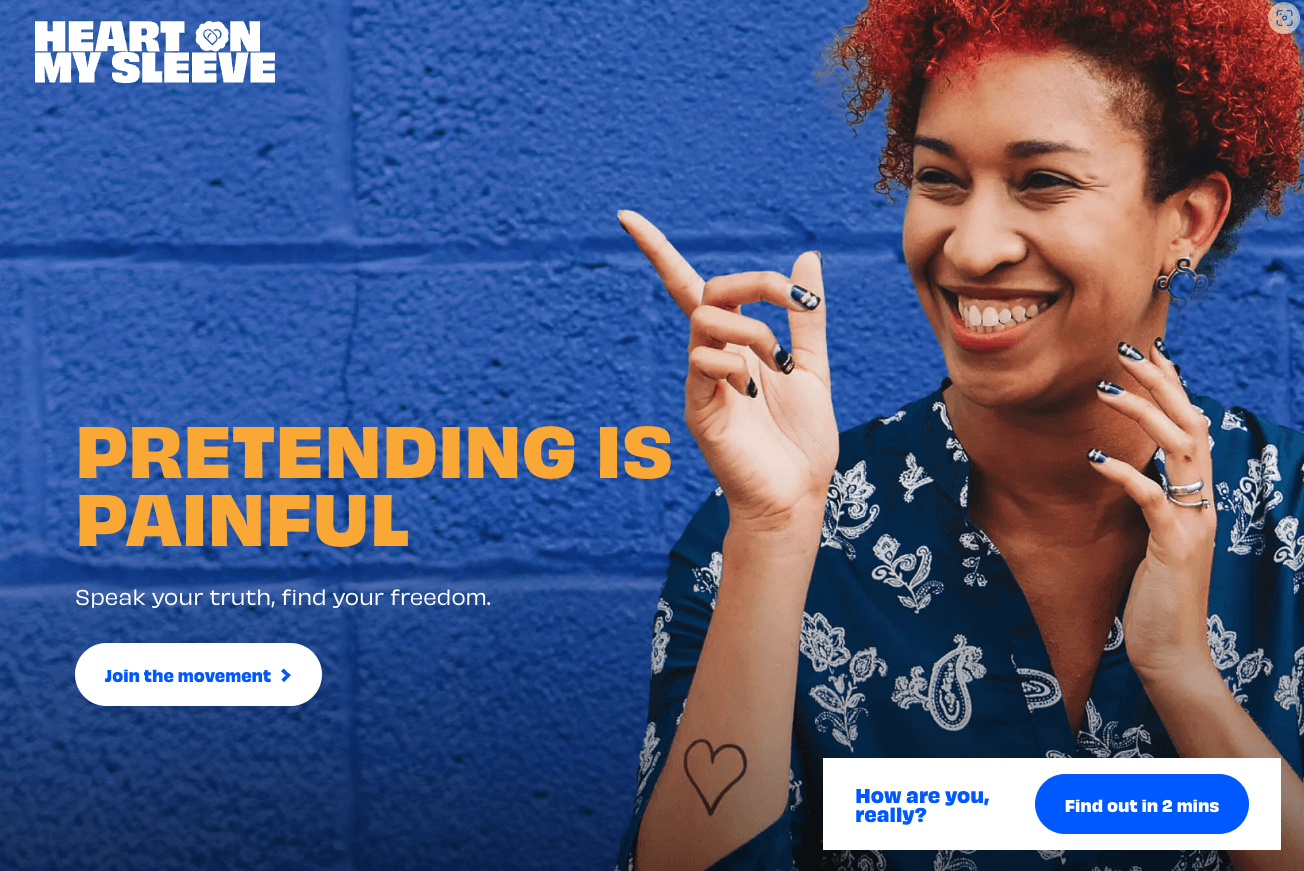
Hand On My Sleeve helps others go from surviving to thriving.
This wasn’t about reinventing the brand—it was about preserving its soul while making it adaptable. As the brand expanded, it needed a white-labeled design system to support partnerships and scale its message across new platforms—without losing its emotional impact.
The challenge
Maintaining the brand’s emotional tone and visual integrity while allowing for flexible, partner-specific branding was key.
Every detail, from spacing to colour overrides, was crafted to ensure emotional clarity and technical precision.
The Solution
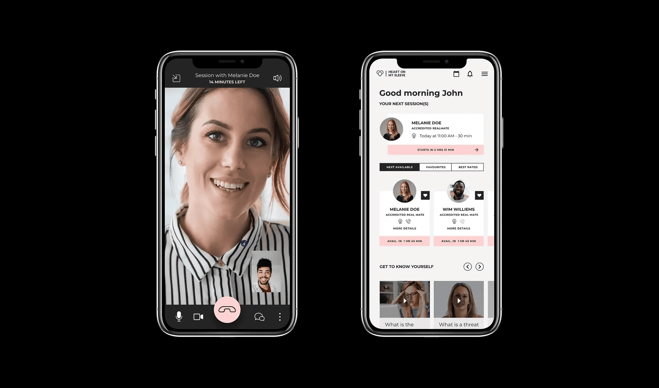
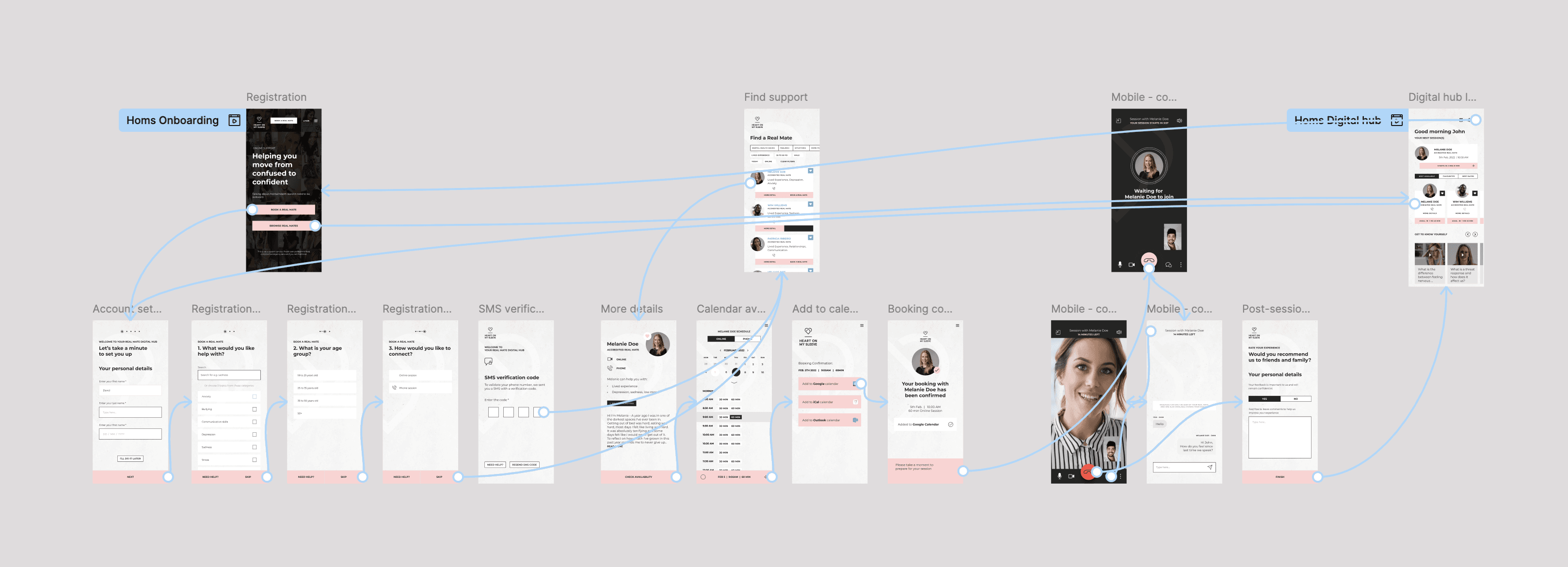
I was brought in to white-label the existing design system, ensuring it could be adapted across multiple use cases while preserving the core identity.
Maintaining the brand’s emotional tone and visual integrity while allowing for flexible, partner-specific branding was key. My focus was on:
Pixel-perfect alignment and scalable components
Minimalist design adjustments to support partner branding
Maintaining emotional resonance through consistent typography and layout
Key Achievements
I delivered 2+ white-labeled versions of the HOMS platform for partner use.
Created a modular design system that balanced brand consistency with flexibility
Reduced design-to-dev handoff time through clean, annotated files
Ensured accessibility compliance across all white-labeled versions
More Works
(SG — 02)
©2024


Overview
Hand On My Sleeve helps others go from surviving to thriving.
This wasn’t about reinventing the brand—it was about preserving its soul while making it adaptable. As the brand expanded, it needed a white-labeled design system to support partnerships and scale its message across new platforms—without losing its emotional impact.
The challenge
Maintaining the brand’s emotional tone and visual integrity while allowing for flexible, partner-specific branding was key.
Every detail, from spacing to colour overrides, was crafted to ensure emotional clarity and technical precision.
The Solution
I was brought in to white-label the existing design system, ensuring it could be adapted across multiple use cases while preserving the core identity.
Maintaining the brand’s emotional tone and visual integrity while allowing for flexible, partner-specific branding was key. My focus was on:
Pixel-perfect alignment and scalable components
Minimalist design adjustments to support partner branding
Maintaining emotional resonance through consistent typography and layout
Key Achievements
I delivered 2+ white-labeled versions of the HOMS platform for partner use.
Created a modular design system that balanced brand consistency with flexibility
Reduced design-to-dev handoff time through clean, annotated files
Ensured accessibility compliance across all white-labeled versions
More Works
(SG — 02)
©2024
Overview
Hand On My Sleeve helps others go from surviving to thriving.
This wasn’t about reinventing the brand—it was about preserving its soul while making it adaptable. As the brand expanded, it needed a white-labeled design system to support partnerships and scale its message across new platforms—without losing its emotional impact.
The challenge
Maintaining the brand’s emotional tone and visual integrity while allowing for flexible, partner-specific branding was key.
Every detail, from spacing to colour overrides, was crafted to ensure emotional clarity and technical precision.
The Solution
I was brought in to white-label the existing design system, ensuring it could be adapted across multiple use cases while preserving the core identity.
Maintaining the brand’s emotional tone and visual integrity while allowing for flexible, partner-specific branding was key. My focus was on:
Pixel-perfect alignment and scalable components
Minimalist design adjustments to support partner branding
Maintaining emotional resonance through consistent typography and layout
Key Achievements
I delivered 2+ white-labeled versions of the HOMS platform for partner use.
Created a modular design system that balanced brand consistency with flexibility
Reduced design-to-dev handoff time through clean, annotated files
Ensured accessibility compliance across all white-labeled versions
More Works
©2024